Toon Tone

Toon Tone

/ Character
SpongeBob from SpongeBob SquarePants (1999)

detail.colorStudy · 31 detail.of 43

SpongeBob's Tie

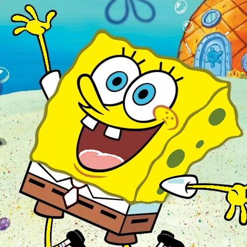
From SpongeBob SquarePants · 1999

#dc2828warm red-orange
H0° S82% B86%R220 G40 B40
detail.tryRound

Color anatomy

Shades — darker

detail.tints

detail.loreTitle

SpongeBob SquarePants debuted in 1999 and introduced SpongeBob to audiences with a distinctive visual identity. The character's color scheme was designed for maximum readability in fast-paced animated sequences.

The tie color #dc2828 is a warm red-orange that's richly saturated and bright and airy. At H0° S82% B86%, it occupies a specific sweet spot in the HSB space — warm enough to feel energetic.

SpongeBob's tie is a color players think they know cold — until they have to dial it in from scratch. The most common mistake is oversaturating (going too intense) and pushing the brightness too high toward white.

detail.tipsTitle

Calibrated to this character's specific hex, not generic color advice.

1Hue: Lock in around 0° — squarely in the orange-red range (0°–30°). Don't drift more than 10° from the target.
2Saturation: Target 82%. This is a vivid, punchy color — err on the side of too saturated rather than too gray. The most common miss is dropping below 60%.
3Keep brightness high — above 80%. This is a light, airy color; going below 70% brightness will push it into a muddy or completely different shade.
4Common mistake: Most players overshoot saturation (too intense) and brightness (too light). Dial saturation back slightly from your first instinct, then lock brightness to match the character's lighting.

detail.nearbyTitle

H30° S82% B86%
H60° S82% B86%
H180° S82% B96%
H210° S62% B86%

detail.relatedTitle

detail.relatedSub

Bender

Metal

#89a7a9

Bananaman

Cape

#fef200

Dopey

Outfit

#b5b11f

Betty Boop

Dress

#dc2e3a
detail.backAll